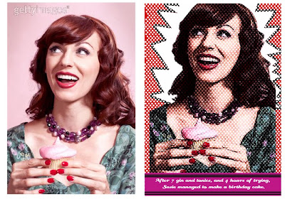
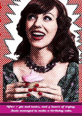
 To follow this tutorial you will have to have some knowledge of Photoshop, but I tried not to use anthing too complicated, so most people could give it a shot. If you have any further questions do not hesitate to leave comments and I'll try to answer your queries. I use variations on this technique a lot, it's very handy for making posters and invitations. I even once made a comic book style present for a friend using a photo of him. I think it could be a fun present to make for a teenager. The image I used for this project I got for free from gettyimages. Here is a before and after of the original picture.
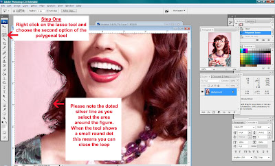
 Step One: Open your photo file. Go to the lasso tool section, right click and choose the second item, this is the polygonal tool. This will allow you to click on multiple points of an image linking them altogether to eventually select a shape, like cutting her out with a scissors. The aim here is to select the woman so that we can get rid of the pink background. With a plain image this can me done with the magic wand tool, but a lot of the time the background is more complicated. I started with the left shoulder and worked my way slowly around the shape clicking every centimeter or so (note do not click too quickly or it will close the loop, take it slowly!). At the end when you come full cirlce a little dot will appear on your tool, this means when you click the start point the selection has been made. While floating your mouse over the selected area right click and choose 'layer via copy'.
 Step Two: Make a new document, A4 in size and 300 dpi ( 29.7cm height, 21 wide). Use your move tool to move your selected ladies head over to the new blank document. It may be much smaller but this is ok cos it can be stretched. Make sure the 'show transform' tool is clicked as shown above, this means there will be a box surrounding your image. Go to the bottom right hand corner and while holding down the shift button scale the image up to A4. At this point the image will pixalate, but after you press the enter button it will be fine. This kind of stretching is fine for this project because we will be altering the image a lot so the quality doesn't have to be very high.
 Step Three: You need to duplicate the layers 4 times. The above image show you the layers window. When a layer is selected it is highlighted in blue, right click on your image layer and 'duplicate layer', repeat this step two more times, so you will now have 4 copies of your image. Select the third image down, ie two above your background layer. Go to 'filter', then choose 'artistic'. A dialogue box will open, on the right hand side there will be an option that says 'fresco', click this and set the levels to 'Brush Size=8, Brush Detail=4, Texture=3'. Note these levels can played with to suit your image, it depends on how much darkness you want. In the layers box you will see 'opacity' set this to 80%. Next with the layer above that go to 'filter', then 'artistic', then choose 'watercolour' as an option. Set the levels at the following 'Brush Detail=14, Shadow Intensity= 4, Texture=3'. In the layers box set the opacity to 50%. With the top layer go to 'filter', then 'artistic', then 'poster edges'. Set the levels to the following 'Edge Thickness=7, Edge Intensity=6, Posterisation=5'. In the layers box beside the opacity it says the word 'normal' scroll down until it says 'multiply'.
 Step Four: With the watercolour layer selected go to 'Image', then 'Adjustments', then 'Replace Colour'. The above dialogue box will pop up. Select a lighter tone in the image, I chose her cheekbones, set the fuzziness to medium/high, and set the lightness to 75-100. This is to bump the contrast between the colours in the image without it being too garish. If needed repeat this step with the layer immediatley underneath.
 Step Five: Select your paint bucket and while your background layer is selected fill in all of the layer with a bright comic book colour. I went for primary red. The next part is to add in the white dots. In this case I was very nice and made up a template for you as it would take too long to explain how to make it, and it's really boring!! So just save the below image and when you bring it into photoshop magic wand out the black to delete the background. The magic wand is the 4th tool down, simply click on the black and then right click, then 'select inverse', then right click again and 'layer via copy'. Move this white dotted layer into your image with the move tool. Place it two layers above the background, ie above one of your image layers so the dots overlap the face, but don't overshadow it too much. To move a layer up and down, go to the layers box, select it and hold down left click while you drag it up/down.
 Step Six: You can add a popping white star burst to the background using the polygonal tool. First create a new layer above your background. Do this by pressing the icon beside the bin in your layers box while you are on the background layer. Then use the polygonal tool to roughly make the star burst shape, after that paint bucket in some white. After this go to 'select', then 'modify', then 'grow' and type in 20. Change your main colour to black and paint bucket once more and you should get a black rim around the star shape.
Step Seven: Lastly add a funny text box to the bottom. Write what ever you like here, or maybe an annoucement for a poster. Make a rectangle with the shape tool (which is below the move tool). Add a new layer above your background and paint bucket the shape, and add some lines to the top and bottom with the line tool. You can change the thickness of the line by typing in different numbers in weight (which is under help). Select the text tool, left click and drag into the shape of the rectangle and get typing! I find a good comic font, or something retro looks good here, there are thousands of free fonts online if you wanted to download some cool ones.
 Ta Da!! That's it!
Posted by Ruth of Nice Day Supplies and Nice Day Designs


Ah this is brilliant - i love the whole pop art vibe! will be trying this one out Ruth!
ReplyDeletep.s LOVE the caption! ;D
Haha I love it! I was looking for ideas for a birthday card design - this is perfect! Thanks Ruth :)
ReplyDeleteI've had "learn photoshop" on my to-do list for what feels like ages! It makes me head hurt. :P
ReplyDeleteThis is awesome though. Very easy for even me to understand. :) Thanks Ruth!
Thanks guys, I was worried that it wouldn't be clear enough. You kowo when you're working with something for years you forget what it's like not to know how to use it. And I know lots of people find photoshop very daunting.
ReplyDeleteVery good tutorial:)gonna be definetly trying this out:)
ReplyDeleteMust be very user-friendly Ruthie! I,m not cowering under the couch! Mind you, I'm not making it either but......! Looks really good tho'
ReplyDelete